.avif)

Side-by-Side Clarity Turned Browsers into Buyers
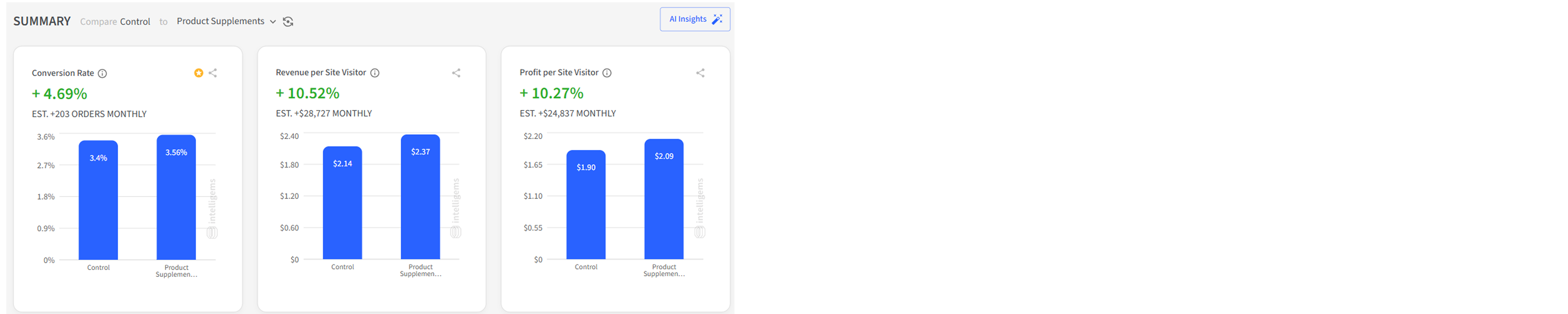
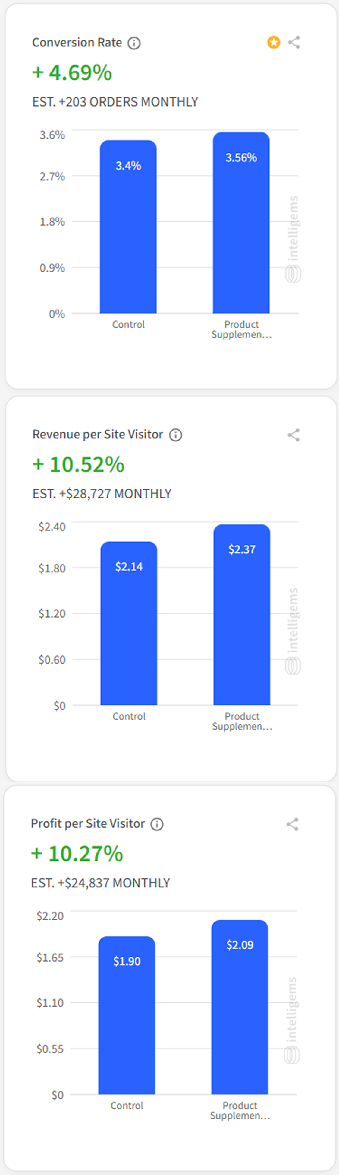
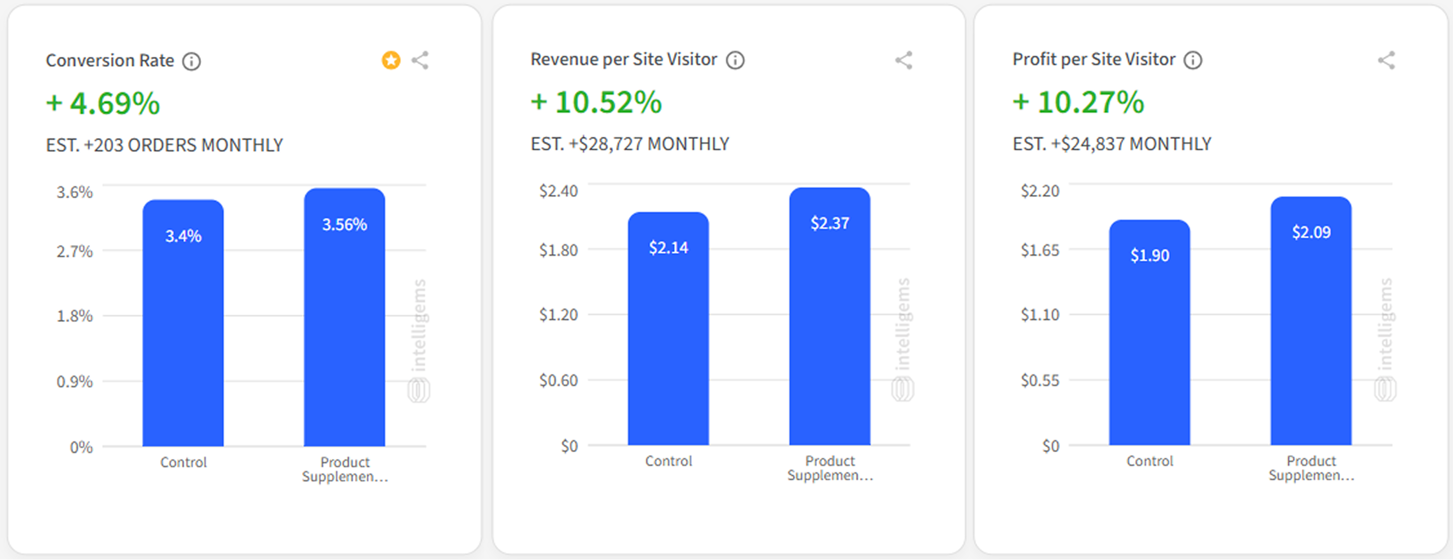
A single, redesigned comparison table let shoppers see the differences at a glance, lifting conversion rate +4.69%, adding 203 extra monthly orders, and contributing $24,837 in monthly revenue – without a traffic bump.
Opportunity
Picture the typical Auri visitor: she lands on the product page, scrolls past vibrant imagery, then starts a familiar dance: clicking variant tabs, opening new windows, and asking yourself, “Is this one stronger than that one?”. The lesson was clear: indecision – not interest – was costing revenue. If we could answer the “Which one is for me?” question in a single glance, momentum would carry shoppers straight to checkout.
Solution
"Give prospects a clear, one-screen answer to “What’s the difference?” right where they decide"
No new photography, no dev-heavy redesign, just friction removed at the decision point:
- One-screen comparison table
- Best-seller spotlight
- Mobile-first clarity
Result
When shoppers can compare in a heartbeat, they buy in a heartbeat. A single table turned variant confusion into confident clicks — proof that the right information, perfectly placed, unlocks revenue already waiting on the page:
- +10.27% Profit per visitor
- +4.69% Conversion rate (95% confidence)
- 203 Additional orders per month
- $24,837 Monthly monetary contribution