


Table Of Contents:
- Elevating Shopify Mobile Usability for E-Commerce Success
- Key Takeaways
- Implementing Responsive Design for Seamless Mobile Experience
- Improving Mobile Navigation to Boost User Engagement
- Accelerating Mobile Page Load Times for Better Performance
- Simplifying Mobile Checkout Process to Increase Conversions
- Optimizing Mobile SEO Strategies for Greater Visibility
- Incorporating Mobile Customer Support Features
- Frequently Asked Questions
- Conclusion
Elevating Shopify Mobile Usability for E-Commerce Success
Ever felt stranded in a sea of slow, unresponsive mobile websites while trying to shop online? You're not alone. This post zeros in on turbocharging your Shopify store's mobile usability, zeroing in on crucial aspects like a fluid responsive design and a snappy menu that won't test your customers' patience. You'll learn to revamp user experience, slash those load times, and streamline checkout to spike conversion rates. Together, we'll ensure your mobile app shines bright on the internet and on search engines, drawing in more customers and sales. Get ready to transform mobile frustration into a seamless shopping spree!
Key Takeaways
- Mobile-responsive design is key for usability across all devices
- Fast load times and optimized images significantly improve user experience
- Simple mobile navigation with clear CTAs enhances the purchasing journey
- Autofill and streamlined checkouts reduce cart abandonment rates
- Regularly updated mobile sitemaps and meta tags boost search engine visibility
Implementing Responsive Design for Seamless Mobile Experience
.jpeg)
Hey there, let's make sure your Shopify store's Homepage shines on every device. It's about optimizing themes for peak mobile responsiveness, so your store looks incredible whether viewed on a phone or a tablet. You'll learn to run your site through the gauntlet of different web browsers and devices, ensuring it plays nice everywhere. Tapping into Google Analytics, E-commerce CRO Strategies know-how, and solid search engine optimization (SEO), this section is geared toward nudging your store up the search engine results page (SERP). Ready to give your customers top-tier mobile shopping? Let's dive in.
Optimize Shopify Themes for Mobile Responsiveness
When you prioritize web design with mobile users in mind, you're ensuring that every visitor has a smooth experience on your Shopify site, regardless of the device they're using. A responsive theme adapts effortlessly to any screen size, keeping your content readable and your layout intact. Think of it as giving your store a personal trainer, geared to flex and fit any screen, perfecting the customer experience you deliver on tablets and smartphones alike.
What's crucial here is speed; nobody likes to wait. Leveraging a content delivery network (CDN) can significantly speed up your site for users worldwide. Quick tip: Regularly clear your site's cache to maintain that snappiness, especially after updating your landing page or adding new products. Fast load times aren't just convenient; they're critical in retaining customers and improving your Google rankings.
Remember, the way your site feels in a customer's hand can be just the thing that clinches the sale. Responsive web design isn't just about squishing and stretching; it's about offering a cohesive, easy-to-navigate shopping experience. Check how your images scale, ensure button sizes remain thumb-friendly, and always preview changes on various devices. Your efforts here cement the foundation for an e-commerce platform that not only looks sleek but also operates seamlessly, anytime, anywhere.
Test Mobile Compatibility Across Devices and Browsers
To truly optimize your Shopify store for mobile, it’s essential to test how it performs across a wide range of devices and browsers. Picture your customers around the globe—some using Androids in Paris, others browsing on iPhones in New York, or perhaps on older tablets in rural areas. Each device and browser interprets your store a little differently. Ensuring compatibility across this spectrum means delivering a consistently excellent experience for everyone, regardless of how they access your site.
Mobile optimization isn’t just about appearance—it’s about function. Adjusting your viewport settings and refining media queries are small changes that can make a massive difference. These tweaks help your store scale fluidly to any screen size, preventing issues like awkward layouts or hidden content. Combine that with comprehensive testing—especially using tools like BrowserStack or real devices—and you'll catch any inconsistencies before they frustrate your users. This level of attention shows customers you care about their experience, turning casual visitors into loyal buyers.
To stay on track, develop a checklist that guides your mobile testing and optimization process. Focus on essentials like verifying that your layout adapts smoothly to different screen sizes, that your pages load quickly even on slower mobile networks, and that interactive elements like buttons and menus are easy to tap without accidental clicks. Each item you check off brings your store closer to being a mobile-friendly destination that’s ready for any shopper, on any device.
Keep this momentum going—you’re not just optimizing a website, you’re enhancing a global shopping experience.
Improving Mobile Navigation to Boost User Engagement
.jpeg)
Alright, we're diving into smoothing out those mobile navigation paths for your Shopify store. Think about it – simple menus make navigating through your online shopping space a breeze for mobile users. By implementing clear call-to-action buttons, you're guiding your customers with ease towards making a purchase, whether they're tapping away in your Magento-integrated marketplace, breezing through the API-powered catalog, or checking out at the point of sale. Stick with us to master your mobile payment flows, and see user engagement take off.
Simplify Navigation Menus for Mobile Users
We all know how frustrating it is to fumble through a cluttered menu on a small screen. That’s why it’s crucial to design clean, intuitive navigation menus for your Shopify store that cater to mobile users. With the help of CSS, you can build drop-downs and fly-out menus that feel natural in a mobile context—menus that work with your users, not against them.
Think about your own mobile habits. When you’re busy, you want to find what you’re looking for in just a few taps. That’s the same experience your customers expect. To deliver that level of ease, simplify your mobile menu by removing unnecessary links and using marketing automation to highlight only the essentials—such as best sellers, new arrivals, or time-sensitive deals. Not only does this decluttering make browsing faster and more enjoyable, but it also helps guide shoppers naturally from product discovery to checkout.
By reducing menu complexity, you enhance the shopping experience in multiple ways. A condensed category list helps users find what they need faster. Featuring promotions within the menu draws attention to your best deals. And a clearly labeled, streamlined path to checkout cuts down on user frustration—meaning fewer abandoned carts and more completed sales.
In short, simplifying your mobile navigation isn’t just about aesthetics—it’s a smart strategy for increasing conversions and creating a smoother, more satisfying customer journey.
Utilize Clear Call-to-Action Buttons on Mobile
When you're tapping around on a mobile device, clear call-to-action (CTA) buttons are your guiding stars through the landscape of online shopping. A savvy JavaScript touch can animate these CTAs to stand out without being obnoxious. Think of these buttons as your site's friendly signposts, offering essential navigation and instruction, telling your customers exactly where to click to seal the deal on their purchase.
Keep in mind, the design of your call-to-action buttons should blend intuition with encouragement. A 'Buy Now' or 'Learn More' needs to pop against your page's background, prompting users to proceed without a second thought. This blend of design and user experience is critical – it provides just the right nudge of information at just the right moment, smoothing out navigation hurdles and ramping up your conversions.
Moreover, size matters when it comes to mobile CTAs. Oversized buttons can scream for attention, while tiny ones play a frustrating game of hide and seek with user fingertips. Find a happy medium where your buttons are thumb-friendly and effortlessly visible. This careful attention to user-interface details can make your store not just easy to navigate, but also a pleasure to shop, boosting user engagement, and customer satisfaction.
Accelerating Mobile Page Load Times for Better Performance
.jpeg)
Speed is key on your mobile phone—slow page loads can turn shoppers away as quickly as a glitchy app. For the ultimate customer experience, you'll want your mobile pages to react with the nimbleness of a desktop computer. Focusing on usability, we’ll show you how to compress images and slim down file sizes without sacrificing quality. Then, we'll tackle those clunky scripts that can bog down performance. These practical tweaks will not just make your site faster, they'll make your customers happier.
Compress Images and Reduce File Sizes for Mobile
When you're setting the stage for a standout mobile shopping experience, compressing images should be high on your priority list. This savvy move not only preserves the aesthetic appeal of your brand but also ensures your user interface remains snappy and responsive. By optimizing your visuals, you're not just tidying up; you're setting a smooth path for your customers to enjoy browsing, which is key to keeping them engaged and primed for purchase.
Consider the technique of lazy loading, which is like having a secret weapon in your site's performance toolkit. What it does is simple but effective: images load only as they're about to enter the user's viewport, preventing unnecessary data from clogging up the initial page load. This means your shoppers can jump right into what they came for – a seamless shopping experience, without any frustrating waits or hiccups along the way.
Remember, in the world of online shopping, customer engagement hinges on how quickly they can interact with your store. By reducing file sizes and implementing best practices like lazy loading, you're not just optimizing for speed; you’re enhancing the overall shopping atmosphere. Trust me, when pages pop up without a pause, your brand shines, and so does your customers' regard for your e-commerce savvy.
Minimize Use of Heavy Scripts on Mobile Pages
Navigating your Shopify store on a smartphone should be as smooth as scrolling through your favorite social media feed. To ensure quick mobile web interactions, it's essential to scale back on heavy scripts that can slow down your site. Emphasizing speed fosters positive user experiences, potentially ramping up your store's conversion rate optimization. Think of it like stripping down a race car; every unnecessary weight removed translates to better performance.
Consider the impact of fonts on your mobile site's load time. You might love a certain font, but if it makes your loyal customers wait, it's not worth the added flair. Streamlining font choices boosts page speed and keeps your audience's attention where it should be – on your products. Adopting well-optimized fonts and minimal scripts keeps your mobile web pages lightweight and ready to race past competitors in the journey toward e-commerce triumph.
Should your store offer a loyalty program, that experience needs to be just as quick and accessible on mobile as it is on desktop. Heavy scripts might interfere, so audit your code and shed any unnecessary bulk. Remember, small tweaks in the backend can lead to large gains in customer satisfaction, ensuring your visitors stay and play rather than bounce away. Your website's nimbleness on mobile platforms is a direct invitation to users, coaxing them into a seamless and enticing digital aisle.
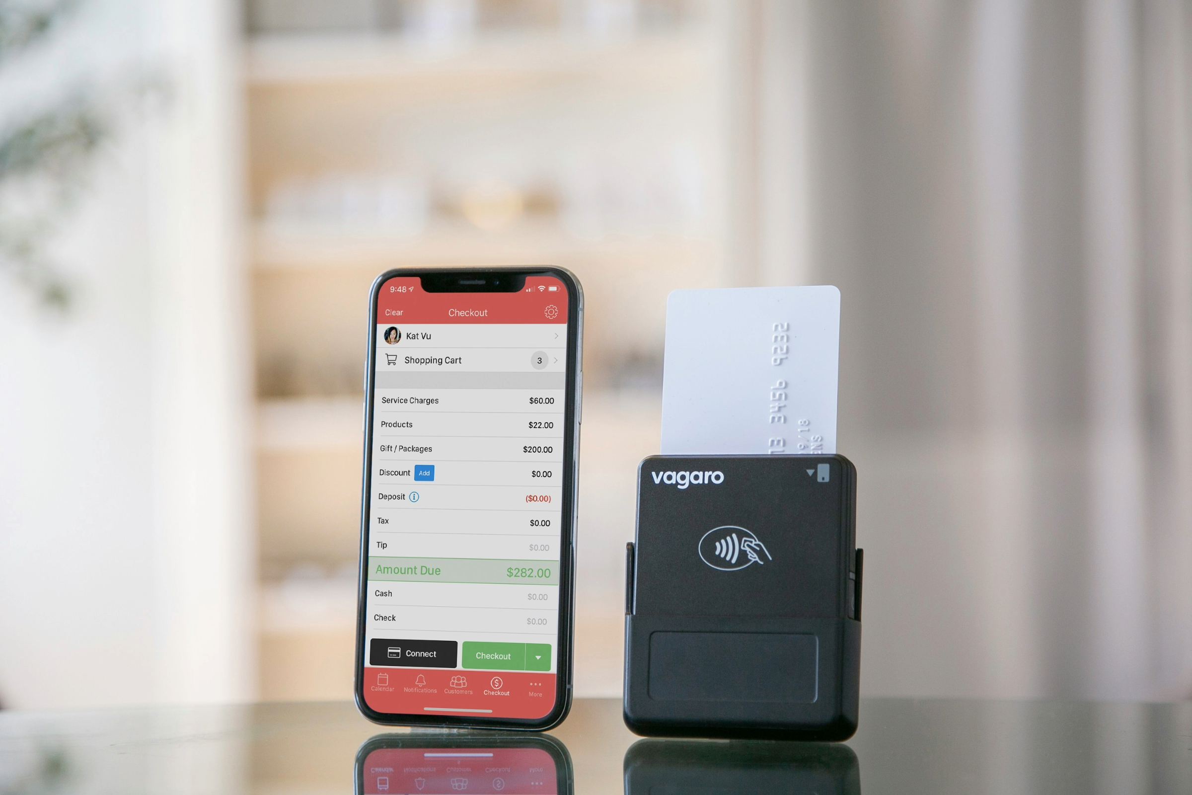
Simplifying Mobile Checkout Process to Increase Conversions
.jpeg)
Hey, if you want to turn browsers into buyers on a mobile device, you’ve got to make checking out a breeze. That's why incorporating autofill and mobile payment options is key – you’re creating a checkout that’s nearly as fast as a tap. We'll also explore ways to reduce checkout steps; too many can be a hassle. You're in for a treat, as we delve into user experience design and web development practices that’ll keep that 'Buy Now' button busy and your conversions climbing.
Enable Autofill and Mobile Payment Options
You know how frustrating it can be to manually enter your shipping and payment info on a mobile device. By enabling autofill in your Shopify store's checkout process, you're drastically reducing the chances of a high bounce rate. This responsive web design choice not only speeds up transactions but also minimizes errors, which means a smoother finish line for your customers.
Let's put data to good use here; by analyzing your site's heat map and analytics, you can identify any friction points in the mobile checkout experience. Are customers abandoning their carts at a certain step? Introducing autofill and mobile payment options like Apple Pay or Google Wallet can eliminate these hurdles, offering a secure and swift path to purchase that customers really appreciate.
Imagine your shoppers moving from cart to completion with just a few taps. That's the power of implementing smart mobile payment solutions. They not only align with exceptional responsive web design practices but also instill trust and encourage repeat business. Making the checkout process as painless as possible practically shepherds your customers through the final, most important step of their buying journey.
Reduce Checkout Steps for Mobile Users
Shopping cart abandonment is a real pain point, isn't it? If your Shopify store's checkout is a maze of unnecessary steps, you might just be shooing customers away. By simplifying the checkout flow, you push up your site's user-friendliness. A lean checkout means fewer opportunities for shoppers to second-guess their purchases, helping ensure that your call to action— that sweet, sweet 'Complete Order' button — gets clicked more often.
Your customers will adore a checkout as speedy as a greased lightning. Imagine this: they pick their favorite item, hit the cart, and—bam!—they're already entering their http info before they can blink. Streamlining these steps not only enhances the subscription business model where ease is king, but it also exemplifies why you're the website builder of choice for discerning e-commerce entrepreneurs.
Crave feedback? Here it is: When checkout is a breeze, smiles spread. Let's lay out the steps for snappy checkouts that'll keep your customers coming back for more:
- Gather essentials first: just the email or mobile number.
- Offer guests a chance to checkout without creating an account.
- Auto-fill addresses to slash typing time.
- Seamlessly integrate trustworthy payment gateways.
- Save payment info for next time, if they're into that.
Each adjustment, believe it or not, has the potential to dial up your conversions. Simplify those steps, ace user experience, and watch your mobile checkout become a one-way street to e-commerce success.
Optimizing Mobile SEO Strategies for Greater Visibility
.jpeg)
Hey, you're well into making your Shopify store a mobile marvel, but there's more you can do to boost those online sales. Using mobile-friendly meta tags and descriptions sharpens the appeal of your store to both users and search engines. Plus, submitting your mobile sitemap isn't just a good point of practice; it's like giving search engines a VIP pass to your site's structure. These tools are essential for enhancing visibility on servers far and wide, maintaining the seamless shopping experience from the moment someone punches in their credit card details to the joy of their purchase.
Use Mobile-Friendly Meta Tags and Descriptions
When you’re dialing in your mobile commerce strategy, think of meta tags and descriptions as your silent power players. They work behind the scenes to ensure your Shopify store grabs attention in mobile search results. By optimizing image alt tags and using mobile-friendly meta descriptions, you increase your visibility where it matters most—on the smaller screens your customers use every day. Combine this with automated meta tag updates, and you’ve got a setup that stays relevant without requiring constant manual input.
As you roll out advanced features like Apple Pay or one-click checkout, don’t forget that your first impression often happens on a search results page. A well-written meta description can act as your digital storefront window—inviting, clear, and full of promise. It sets the tone for what users can expect, signaling a fast, mobile-optimized shopping experience. These compact HTML snippets may be easy to overlook, but they play a crucial role in driving clicks and setting expectations.
Your Shopify store isn’t just a place to make purchases—it’s an online destination. Meta tags and descriptions are the signposts that help shoppers find you and feel confident clicking through. When done right, they highlight your products, convey trust, and ensure that your site looks polished and professional on mobile screens.
Instead of thinking of them as technical chores, treat them as strategic tools—guiding mobile shoppers straight to your virtual shelves with clarity and style.
Submit Mobile Sitemap to Search Engines
When it comes to elevating your Shopify store on the world wide web, submitting your mobile sitemap to search engines is a proactive step you shouldn't skip. This not only speeds up the indexing of your store's pages but also ensures that your most recent updates are noticeable on search engines, providing a direct line to your site. By doing so, your store benefits from increased discoverability, helping customers find you with the ease of a quick scroll.
Implementing a mobile sitemap is particularly powerful if you're embracing trends like progressive web apps for your Shopify store. As you work to engage shoppers with a high-speed, app-like experience, your sitemap submission acts as a beacon, guiding search engines and shoppers alike through your streamlined marketplace. Enhanced visibility feeds directly into your email marketing efforts, where each click can lead to a full cart and a satisfied customer.
Your e-commerce journey on the world wide web should be a smooth sail, not a baffling maze. Therefore, keep your sitemap updated to reflect the latest structure of your store; think of it as a map for search engines to navigate smoothly through your digital aisles. Immediate updates mean that even the newest product listings and categories are ready for discovery, helping you outpace competitors and meet your customers' needs without delay:
- Ensure your sitemap is current and comprehensive.
- Include links to all mobile-optimized pages.
- Regularly re-submit your sitemap after major updates.
Incorporating Mobile Customer Support Features
.jpeg)
Now, let's enhance your Shopify mobile usability by adding those small touches that make a big impact on customer support. Incorporating click-to-call buttons provides your shoppers with an instant line for help, while integrated live chat support answers queries in real-time, right in the mobile space. Both features are crucial for stellar customer service, especially on accelerated mobile pages where swift behavior and support are expected. These integrations ensure that you're just a tap away from assisting your customers, boosting their confidence in your retail experience on Google search and beyond.
Add Click-to-Call Buttons for Immediate Support
You know the scenario: a customer is filling their cart on your Shopify store, everything’s going smoothly—until something goes wrong. Maybe it’s confusion about a discount code or uncertainty during the mobile payment process. In that crucial moment, a click-to-call button can make all the difference. Placed in a visible spot—ideally above the fold—it offers instant, human help, minimizing frustration and reducing the chance of a customer abandoning their cart.
A well-placed, easy-to-tap call button does more than provide convenience—it builds trust. It reassures shoppers that support is only a tap away, no long forms or delayed email replies. That sense of immediate access can be the deciding factor that keeps users on your site and moves them confidently toward checkout. It’s a subtle but powerful way to show you’re ready to assist, especially during those split-second moments when doubt can derail a sale.
Adding a click-to-call feature can directly impact your store’s performance. It reduces cart abandonment by removing friction, increases customer satisfaction through rapid support, and helps resolve mobile payment issues on the spot—leading to more completed purchases. Instead of losing a customer to a preventable hiccup, you give them a reason to stay, finish the purchase, and come back next time.
In today’s mobile-first shopping environment, speed and support matter more than ever. A click-to-call button is a simple, customer-focused feature that delivers both.
Integrate Live Chat Support on Mobile Platform
Integrating live chat support into your mobile Shopify store transforms it from a basic shopping site into an interactive, customer-first experience. With just a tap, users can connect instantly to get help with anything from tax questions to payment issues—including using methods like Google Wallet. This kind of real-time communication doesn't just resolve problems quickly; it builds confidence and encourages users to follow through with their purchase, improving overall satisfaction and performance in usability testing.
On mobile, clarity is everything. Live chat interfaces are designed with clean layouts and responsive fonts, ensuring messages are easy to read and respond to—even on smaller screens. A well-implemented live chat system eliminates the need for customers to leave the checkout flow to seek help, keeping them engaged and moving forward. This sense of support helps reduce hesitation and cart abandonment, especially when dealing with complex questions or technical issues.
Every conversation you have through live chat is more than just a support exchange—it’s a chance to build trust. Whether it's helping someone figure out shipping times or assisting with a digital wallet payment, your responsiveness shows that your store is not only efficient but human. By making support feel instant and accessible, you position your brand as a reliable partner in your customer’s journey—not just a seller.
Frequently Asked Questions
How does responsive design impact my Shopify store on mobile?
Responsive design ensures your Shopify store adapts to mobile screens, improving user experience, boosting SEO rankings, and potentially increasing mobile conversions.
What strategies improve user engagement through mobile navigation?
To boost mobile navigation engagement, focus on simplified menus, thumb-friendly design, and fast loading speeds, ensuring a seamless, user-friendly shopping experience.
Can accelerated page load times affect my store's performance?
Absolutely, faster page load times can improve your Shopify store's user experience, potentially boosting conversion rates and reducing bounce rates.
How does a simplified checkout process boost mobile conversions?
A streamlined checkout minimizes barriers, speeds up transactions, and caters to on-the-go users, significantly improving mobile conversion rates.
What are effective mobile SEO tactics for Shopify visibility?
Optimizing your Shopify store for mobile SEO involves a responsive design, fast loading speeds, and clear, tap-friendly navigation ensuring a seamless user experience that can significantly enhance your store's online presence.
Conclusion
Boosting mobile usability for your Shopify store isn't just about aesthetics; it's critical for converting visitors into loyal customers with a seamless shopping experience. By optimizing mobile responsiveness, simplifying navigation, and speeding up load times, you ensure that your store operates smoothly on any device. Reducing checkout steps and incorporating immediate support features like click-to-call and live chat can dramatically enhance the shopping experience, leading to better conversion rates. These strides in mobile usability are indispensable, positioning your Shopify store to lead in the competitive e-commerce landscape and keep customers returning.