.avif)

Same Page, Two Audiences, One Big Lift
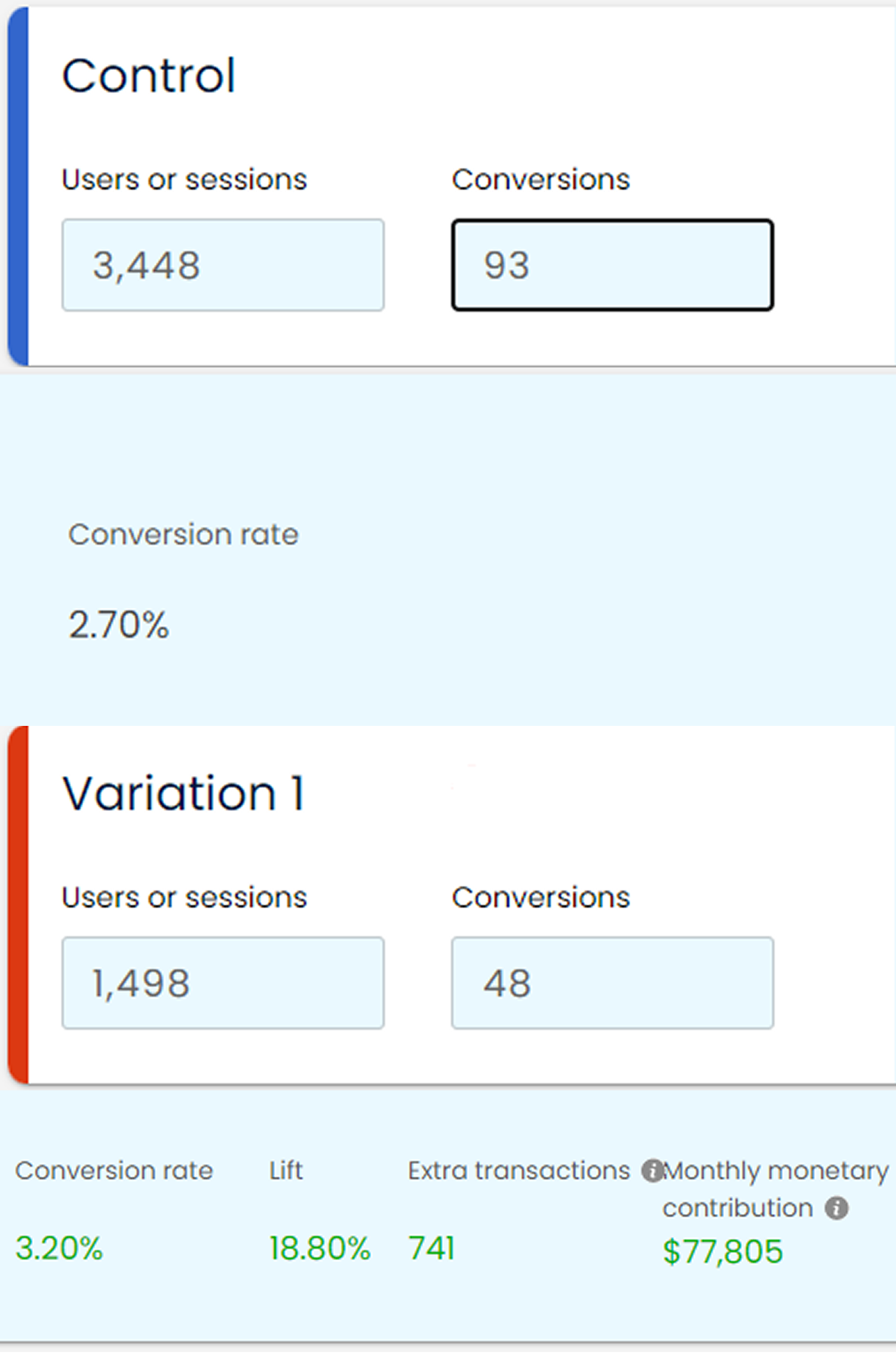
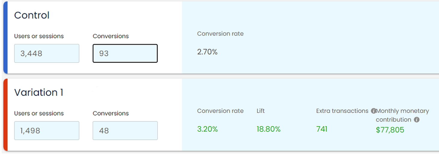
Sometimes the message is perfect; just hiding in the wrong spot. By elevating one must-see proof section, we turned hesitation into action, gaining +18.80% conversions, 741 extra monthly sales, and $77,805 in additional monthly revenue.
Opportunity
Split-traffic analysis showed that middle-of-funnel (MOF) visitors, still weighing options, behaved differently from bottom-of-funnel (BOF) shoppers, who arrived primed to buy. Yet both audiences hit the same long-form landing page (LP1) with a buried, multi-step checkout. We built a lighter variant featuring a condensed Buy Box: price, bundle selector, trust badges, and a single "Buy Now" button; no extra copy, no modal cart. The plan:
- Run two separate A/B tests: MOF traffic LP1 vs LP2, and BOF traffic LP1 vs LP2.
- Measure how each segment reacts to the new, streamlined buying flow.
Solution
"The sooner each audience sees the offer that matches its intent, the faster they commit."
Applying that premise, we made five focused moves:
- Buy Box Above the Fold: Placed price, variant picker, and CTA in the hero for LP2. MOF sees the deal early; BOF can purchase within 5 seconds.
- Audience-Tuned Messaging: MOF headline = outcome + social proof. BOF headline = scarcity trigger.
- Seamless Quantity Selector: Embedded bundle dropdown directly in the Buy Box - no page jump.
- Sticky Mobile CTA: Keeps action a thumb-tap away without blocking content.
- Proof Cluster Adjacent: Eliminating the need to scroll for reassurance
Result
Segment-specific Buy Box placement proved that when intent differs, layout must too. A single component, moved and messaged with purpose, delivered seven figures in annualised revenue without a full-page rebuild.
- +18.80% overall conversion lift (weighted average, 95% confidence)
- Total gain: 741 additional monthly sales
- $77,805 monthly monetary contribution
.png)