.jpg)


When a shopper lands on your website, they decide whether to stay or leave in seconds. Every element on the page, from the spacing between sections to the way a button reacts when clicked, shapes that decision. Most visitors won’t consciously notice design details, but they will feel them. That feeling determines if they trust what they see enough to buy.
Consider two stores selling the same product.
One feels crowded, with overlapping offers and colors that compete instead of guide. The checkout button hides below a long scroll, and the site takes just a little too long to load. The other breathes. It’s quiet, structured, and easy to move through. You know exactly where to go and what to do next. The difference between them isn’t the product; it’s the experience.
Good user experience (UX) turns curiosity into confidence.
Bad UX turns intent into hesitation.
And hesitation kills sales faster than any competitor ever could.
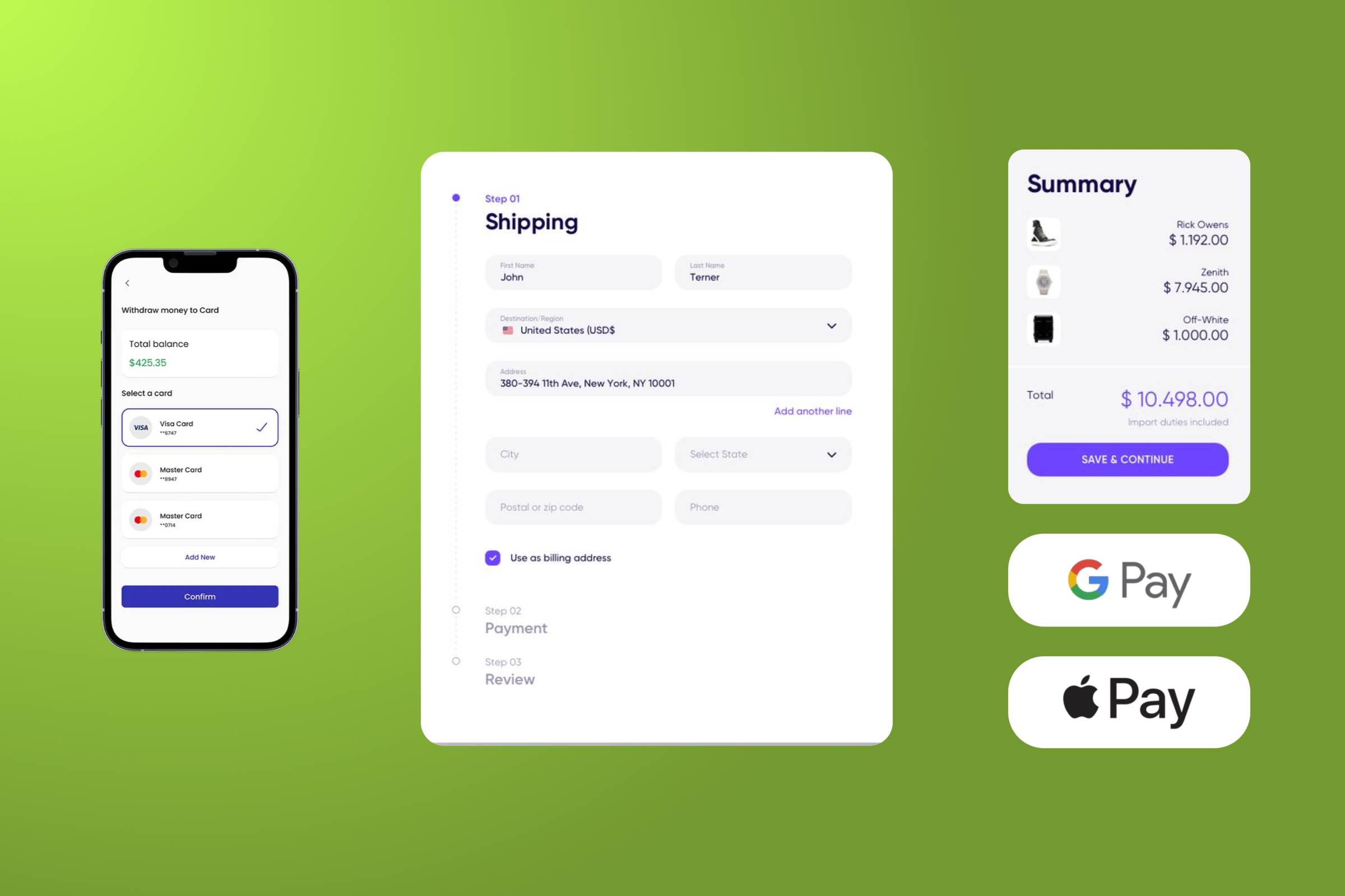
Every click, scroll, and delay adds or removes a layer of trust. The design doesn’t just show your brand, it silently tells customers whether they can rely on you. That’s why improving user experience is one of the most powerful levers for increasing ecommerce revenue, especially when aligned with solid SEO fundamentals that amplify discoverability and trust.
Good UX Builds Trust (and Trust Sells)
Trust is the quiet currency of e-commerce. Long before a shopper decides to click “Buy,” they’ve already made a judgment about whether your store feels reliable. That judgment happens fast, often before they’ve even read a line of copy. Visual order, spacing, tone, and rhythm all tell a story about your brand’s competence. A well-structured page signals control and care. A chaotic one whispers the opposite.
Customers begin to trust a store when the experience behaves exactly as they expect. When buttons behave as expected, when typography and color stay consistent, when prices and information are placed exactly where the shopper expects to find them, that predictability feels safe. The smoother the experience, the more credible the offer becomes.
Some brands try to buy trust with discounts or guarantees. However, no promotion can compensate for the unease of a broken workflow or unclear hierarchy. The more effortless the decision feels, the stronger the desire to complete it.
Embed Video: “How to Become More Trustworthy at Your Shopify Store (And Close More Sales)”
As our CEO, Igor Silva, explains, every small detail of your store’s UX, from spacing and microcopy to visual balance, communicates trust long before the sale happens. When design reinforces credibility, the entire buying journey feels natural, not forced. It’s what turns browsers into buyers and visitors into repeat customers.
Small Frictions, Big Losses
Every online store loses sales that never show up in analytics.
A customer hesitates for half a second, the page stutters before loading, a button shifts slightly out of sight, and the sale disappears. These are invisible losses, the kind no dashboard fully captures. Yet they accumulate until they shape your entire conversion rate.
Friction doesn’t always look like a big design mistake. Sometimes it’s a minor delay, a misplaced label, or a single extra field in checkout. In e-commerce user experience, every small obstacle compounds. And because customers rarely complain, they just leave, friction becomes one of the most expensive problems most stores never see.
When a website feels effortful to use, it silently tells the shopper: this might not be worth it. The harder they have to think, the faster intent fades.
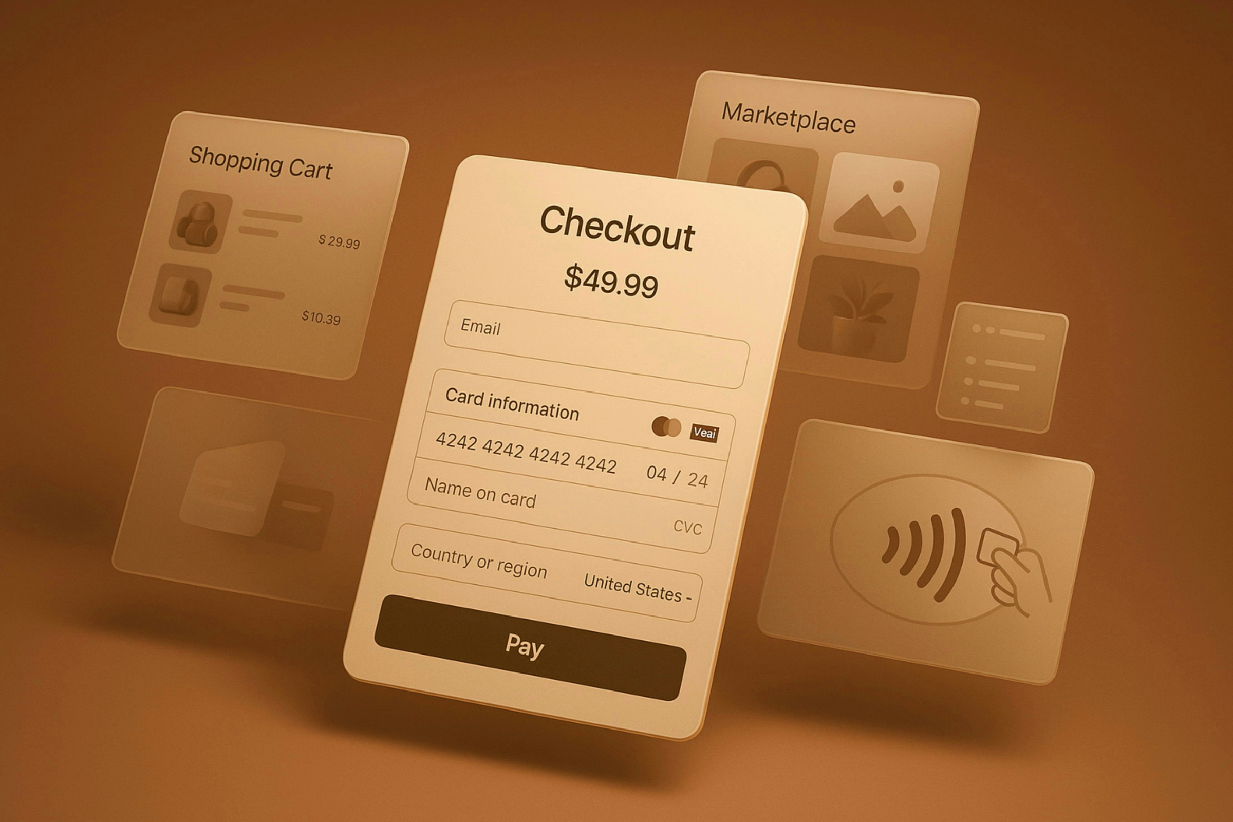
The Hidden Cost of One Extra Click
One unnecessary click might not seem like much, but multiplied across thousands of visitors, it becomes a wall between attention and action.
Imagine you’re ready to buy, but the “Add to Cart” button isn’t where you expect. You scroll, pause, and search. That two-second delay breaks momentum.
In user experience design, momentum is money, and once it’s lost, few recover it.
Even something as small as a secondary pop-up or a product carousel that shifts focus can chip away at user trust. These interruptions don’t just slow navigation; they raise doubt. And doubt is what kills conversions long before checkout.
Brands that obsess over aesthetics often overlook flow. But flow, the seamless progression from interest to action, is what defines great UX. The fewer choices, clicks, and steps required to purchase, the higher the conversion rate climbs.
How to Identify Friction Points in Your Store
Spotting friction starts with empathy.
Step into your store as if you were the shopper, not the owner. Try to complete a purchase from your phone during a commute, or navigate a category page with one hand. Where do you hesitate? Where do you scroll back? That hesitation is friction.
Beyond intuition, tools make the invisible visible. Use analytics and behavioral tracking tools to see what users actually do, not what you think they do:
- Hotjar and Microsoft Clarity reveal where users pause, scroll, or rage-click.
- Heatmaps and session replays uncover hesitation points you’d never find in reports.
When users drop off midway through a form or vanish right before checkout, what looks like hesitation is usually discomfort.
Focus first on the high-intent areas, the pages closest to revenue. Improvements there often deliver disproportionate gains:
- Cart and checkout flow: remove redundant steps and friction-heavy fields.
- Product pages: ensure CTAs and key information are always visible.
- Navigation menus: simplify choices and reduce cognitive load.
When you eliminate small frustrations, you’re not just speeding up the process; you’re strengthening the emotional rhythm that makes a purchase feel effortless.
Simple Layouts Sell More
Complex design doesn’t impress; it overwhelms. Many e-commerce stores confuse attention with persuasion, filling screens with motion, pop-ups, and competing headlines. Every new element steals focus from what actually sells: clarity. In e-commerce user experience, a clean layout goes beyond structure, shaping an immediate sense of confidence.

A page that feels calm allows the mind to decide faster. Space, rhythm, and contrast guide the shopper’s eye without effort, making the journey feel natural. This sense of ease is what drives conversion rate optimization forward: when the design helps users breathe, they buy.
The ‘Less Is More’ Principle in E-commerce
True simplicity leaves room for personality to stand out, because nothing competes for attention.
Minimalism in UX is not a visual style; it’s a business decision. The goal isn’t to strip everything away but to remove the friction that clouds intent. A simple structure helps users understand what matters and act on it without hesitation.
A strong example of this principle came from Infinite Age, a health and wellness brand we worked with that relied heavily on paid traffic. Visitors arriving from ads were already interested; what stopped them wasn’t intent but clutter.
Session replays showed buyers pausing on a dense landing page filled with competing CTAs, long lifestyle videos, and walls of secondary copy. Every scroll diluted momentum.
We redesigned the page using what we call the Zero-Friction Blueprint, a framework that asks one question before keeping any element: does it clarify the offer or advance the sale?
That focus reshaped everything:
- A single, validated headline and one clear CTA above the fold.
- A strong visual hierarchy guiding scanning eyes from product to proof.
- Trust signals, reviews, star ratings, and live counters, placed exactly where hesitation peaks.
- A mobile-first layout that loads fast and flows naturally toward checkout, supported by a solid development foundation, where speed and structure are designed to enhance UX, not fight it..
The results spoke for themselves:+20.81% conversion rate, 554 extra monthly sales, and $58,170 in new revenue.
Simplifying design didn’t make Infinite Age’s brand feel smaller; it made it feel smarter. By aligning design with human behavior, the store turned layout clarity into lasting trust and measurable growth.
Design That Feels Good Converts Better
Buying decisions rarely start with logic.
They start with comfort, the quiet sense that a store feels right. When a visitor enjoys the experience of browsing, trust forms faster, and hesitation fades. That feeling is the foundation of every high-converting ecommerce experience.
Great UX design doesn’t just remove friction; it adds emotion.
When layouts breathe, typography calms the eye, and colors align with the tone of the brand, users feel safe to continue. Good design speaks in emotion: it guides perception, reduces tension, and helps users trust the experience without thinking about it.
Emotion Is the Real Conversion Driver
Emotion drives attention, and attention drives action. A store can have flawless functionality, but if it feels cold or inconsistent, users won’t stay long enough to convert.
The most effective ecommerce user experience creates what psychologists call “emotional fluency”, when a page feels intuitive, the brain interprets it as trustworthy.
Comfort becomes credibility.
Consistency in tone, motion, and feedback builds an invisible layer of trust. Every animation that feels smooth, every micro-interaction that reacts instantly, adds to that feeling of ease. And when users feel understood, they buy with confidence.
Colors, Spacing, and Flow That Guide the User
Design guides behavior the way lighting guides mood in a room.
Colors shape perception, spacing directs attention, and visual flow tells a story without words. Together, they form the emotional rhythm of a sale.
This principle was tested during a product page redesign for a wellness brand, where cluttered sections and a buried call-to-action were quietly hurting performance. Instead of adding more offers, the team simplified the layout, stacked information in the order users expected it, and kept the CTA visible throughout the scroll.
The results were subtle but significant: +2.39% in conversion rate and a 1.14% boost in monthly revenue, all without additional traffic.
A smoother structure simply made buying feel easier, proof that clarity can outperform incentives.
When every color, margin, and transition supports focus, users stop noticing design entirely, and that’s when it’s working.
Test Like a Customer
Great user experience grows from observation, not opinion.
Designing in isolation can make even the most beautiful store feel disconnected from reality. The only way to understand how users move, hesitate, and decide is to watch them do it. Real behavior has a way of exposing what design hides.
Observation clears the fog of personal bias. When you see shoppers pausing before checkout or missing a call-to-action entirely, you start to notice patterns. Those moments are lessons, not failures. They show where attention drifts, where curiosity dies, and where sales quietly slip away.
Progress in UX happens one friction point at a time, and each one resolved is another step toward a smoother path to purchase.
Why Testing Beats Guessing
Intuition builds ideas. Testing proves them.
Redesigns driven by instinct often solve the wrong problem, while testing shines a light on what truly influences conversion. The process is less about creativity and more about curiosity, asking, why did this feel harder than it should?
A few principles keep testing grounded:
- Challenge your assumptions. A page that looks flawless may still confuse real visitors.
- Watch before fixing. Notice where users hesitate or backtrack; those pauses reveal more than feedback forms ever will.
- Move in small steps. Incremental experiments produce clarity faster than complete overhauls.
Testing turns UX into a continuous conversation between data and design, one that never stops teaching.
Simple Tools to Test UX
Effective testing doesn’t rely on expensive software. A short list of reliable tools can uncover more truth than any opinion ever could.
- Hotjar and Microsoft Clarity map movement, clicks, and scroll patterns, turning abstract behavior into something visible.
- Google Analytics 4 exposes where engagement fades and where users drop off.
- A/B testing tools confirm which versions actually help people take action.
The tools don’t do the work, discipline does. Testing consistently builds sharper instincts and helps creativity aim at what matters most: making decisions effortless.
Track What Matters: Bounce, Time, Conversions
Metrics translate behavior into clarity. They show how visitors move through the store, where they pause, and where intent fades. Reading them well means seeing the experience through numbers.
Pay special attention to trends, not snapshots:
- A falling bounce rate suggests users feel an immediate fit with your content.
- Longer sessions often mean curiosity flows naturally from one page to the next.
- Rising conversion rates confirm that friction has been replaced by flow.
Numbers don’t just measure performance; they translate the emotion of usability into something you can act on.
Conclusion
Every click reflects a decision. When a store feels effortless to use, shoppers stop thinking about design and start focusing on what they came for. They move through the journey with ease, and that ease turns curiosity into trust.
Progress in e-commerce rarely comes from adding more features. It grows from clarity, rhythm, and empathy, the small details that make people feel understood while they buy. Each improvement, from faster pages to cleaner layouts, strengthens the connection between experience and sales.
Good UX is quiet work. It doesn’t demand attention; it earns it. When design aligns with how people think and move, selling stops feeling like persuasion and starts feeling like service. At Vasta, this mindset guides every project we build and share, from the insights on our blog to the reflections that Igor Silva brings to Instagram, YouTube, and LinkedIn, where design and strategy meet in real conversations about what makes online experiences work.