.jpg)


If your store gets visits but few sales, something in the experience might be working against you.
You have great products, sharp photos, and ads that bring people in, yet they still leave before buying. It often comes down to the small details that shape how your store feels to navigate.
A dull “Buy” button, a crowded menu, or a checkout that asks for too much information can quietly drain momentum. Each hesitation creates distance between your customer and the purchase. Over time, those micro-moments of confusion become lost revenue.
That’s where strong user experience design (UX) makes the difference. It gives your store rhythm and flow. A shopper should feel guided without effort, like walking into a physical store where every aisle makes sense, every sign helps, and the checkout is exactly where you expect it.
When the online path feels natural, customers don’t stop to think about what to click next. They simply keep moving forward.
Fast pages, clear actions, and consistent layouts turn browsing into buying, and that’s how great UX quietly drives sales.
Navigation: The GPS of Your Store
Your navigation is the first real test of your store’s usability. It decides whether visitors feel guided or lost. A clear structure makes shopping intuitive, while confusion sends people away before they even see what you sell.
Help Shoppers Find What They Want Fast
A store’s navigation works like its map. When it’s clear, people move naturally. When it’s confusing, they stop and look for exits. On an e-commerce site, a visitor’s patience is measured in seconds. If they can’t find what they want fast, they won’t try twice.
A simple, structured menu makes your store feel logical. Use familiar words, not internal jargon. “Men,” “Women,” and “Sale” guide better than “Collections” or “Catalog.”
Each label should feel like the next obvious step. Research from Baymard Institute shows that unclear navigation is one of the main reasons shoppers leave before finding a product.
Good navigation also respects how people actually shop. Someone looking for sneakers may not know the brand yet; they’re thinking “running shoes” or “white sneakers.” That’s why your menu and filters should reflect the language your customers use, not your internal categories.
Design Categories That Match How People Think
Category structure is what shapes discovery. When it mirrors how users browse, it feels intuitive. When it doesn’t, every click becomes work. Use search data, on-site analytics, and even customer questions to find the real words people use. Those insights often reveal what’s missing or mislabeled in your menu.
The best stores think of categories as storytelling tools. For instance, instead of listing dozens of brands, group them under “Outdoor Running,” “Everyday Comfort,” or “Minimalist Style.” You’re helping shoppers connect the dots between what they want and what you sell.
Clear hierarchies also make your site easier for search engines to understand, which is a key part of e-commerce SEO. Pages that are logically connected and easy to crawl tend to rank better, bringing in more qualified visitors.
Make Mobile Navigation Effortless
On mobile, space is tight and attention is even tighter. The best mobile experiences make people forget they’re on a smaller screen. Persistent bars, collapsible filters, and sticky “back to top” buttons help users stay oriented.
Avoid deep menu layers that bury products. Instead, surface the essentials first, then reveal more only when needed. A clean, predictable structure reduces the effort it takes to browse. In e-commerce, less effort means more sales.
Well-built mobile navigation also improves e-commerce site performance. Fewer elements mean faster loading, and faster pages keep visitors moving through the store instead of dropping off.
Product Pages That Actually Sell
A great product page doesn’t just show what you sell. It helps people feel confident about buying it. Every image, line of text, and design choice should reduce hesitation.
When a page answers questions before the shopper even asks, it keeps momentum high and makes the decision to purchase feel natural.

Show, Don’t Confuse: How Visuals Build Trust
Visual presentation shapes the first impression of quality. Clear, detailed images allow customers to imagine the product in their own hands.
Use multiple angles, close-ups, and lifestyle photos that show the product in real situations. These visuals create a sense of ownership that builds trust faster than any headline can.
Short videos are also powerful. A quick clip of how a product looks in motion or how it’s used tells more than a long paragraph ever could. Keep it authentic and focused on experience, not on production value.
Good visuals also support conversion by guiding attention. The main call to action, the “Add to Cart” or “Buy Now” button, should stay visible as the user scrolls. Consistency in size, color, and position helps create a rhythm that feels natural, not forced.
Write Copy That Helps People Decide
Copy on a product page isn’t decoration; it’s part of the decision-making process. Shoppers read with purpose. They want clear, structured information that answers three questions:
- What is it?
- How does it work?
- Why should I trust it?
Keep descriptions conversational but precise. Replace filler phrases with details that help visualize the product: materials, dimensions, usage, and benefits. Organize information in short paragraphs or bullet points when clarity matters more than storytelling.
Tone consistency also builds credibility. Your voice can reflect your brand’s style, but it should remain honest and easy to follow. The goal is to make shoppers feel informed enough to click “buy,” not overwhelmed with adjectives.
Use Reviews and Social Proof Wisely
Customer reviews are modern word of mouth. They show that real people have already trusted your store and were satisfied. Place ratings and reviews close to the product’s main details, not buried at the bottom of the page. Shoppers should see social proof before they doubt their choice.
Highlight the number of reviews and when they were written. Fresh feedback feels more trustworthy. If possible, include customer photos or verified purchase tags to make the experience feel real.
Balance is important. Too much emphasis on reviews can distract from the product itself, but too little can make your page feel empty. The right mix reinforces credibility without changing the focus of the page.
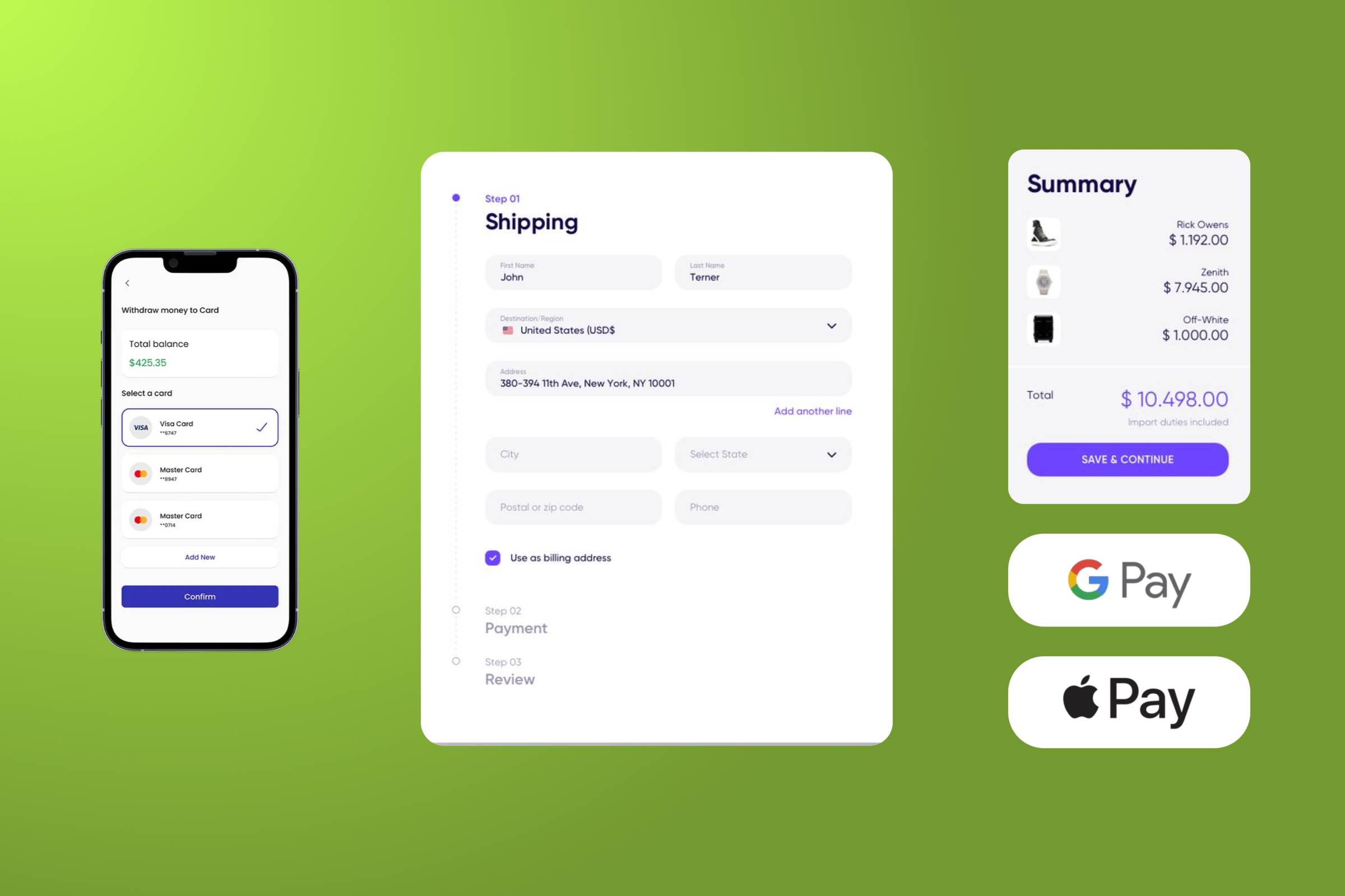
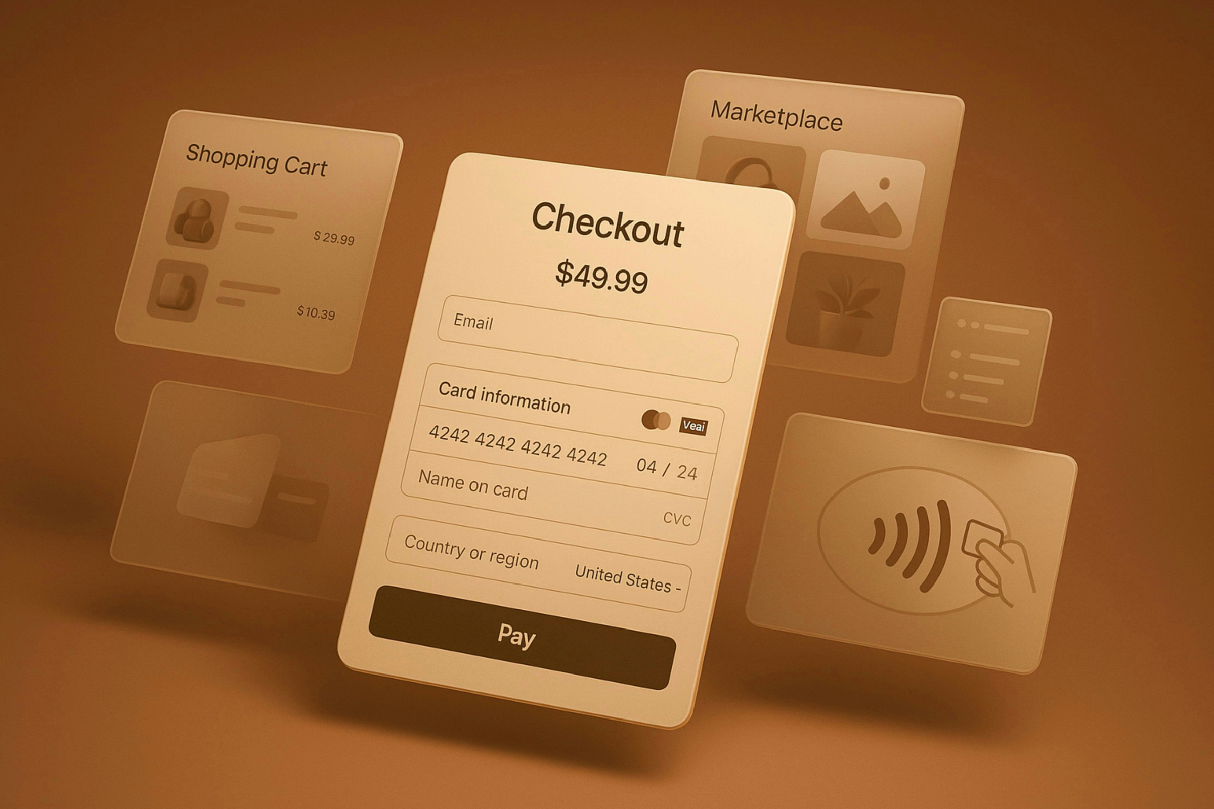
Checkout That Doesn’t Kill the Sale
Checkout is where intent turns into action. It’s also where most sales die. Even small hurdles like extra fields, unclear steps, or a slow page can make customers abandon their carts. A clean and predictable checkout keeps attention on completing the purchase instead of rethinking it.

Simplify Every Step of the Checkout Flow
A smooth checkout feels like a straight line from cart to confirmation. Each unnecessary click or question breaks that flow.
Ask only for the information you truly need. Autofill, address lookup, and progress indicators help customers move faster and stay confident in what they’re doing.
Design matters as much as functionality. Keep the main button visible throughout the process, use consistent colors for actions, and remove distractions that pull attention away from finishing the purchase.
When checkout feels simple and direct, people are more likely to complete it.
On mobile, simplicity becomes essential. Typing on small screens is tiring, and users expect speed. Short forms, input suggestions, and guest checkout options make a big difference in keeping conversions high.
Build Payment Trust with Visual Cues
At the payment stage, shoppers need reassurance that their information is safe. Small signals can do more than long explanations. Use visual cues that create instant trust, such as:
- familiar payment icons
- visible SSL or HTTPS indicators
- a clean, uncluttered layout around payment fields
Position refund and return policies close to the final confirmation button, where doubts usually appear. Make them easy to read and straightforward, not hidden behind links or pop-ups.
Clarity here doesn’t just reduce hesitation; it strengthens credibility.
Offering flexible payment options also builds trust. Digital wallets and regional methods help customers pay the way they prefer, while clear summaries of total cost and delivery prevent unpleasant surprises before payment.
Recover Abandoned Carts the Smart Way
Not every abandoned cart means a lost sale. Many users simply pause the process and plan to return later. Your goal is to make that return feel effortless.
Automated reminders sent within a day are usually enough to bring people back, especially if they include the exact products left behind.
Gentle retargeting ads or short emails work best when they match the calm tone of your store instead of sounding pushy.
Consider adding small incentives that remove friction, such as free shipping or a limited-time discount. The point isn’t pressure; it’s convenience. When the reminder feels helpful rather than persuasive, the customer comes back because it’s easy, not because they’re being chased.
The Technical Side of UX
Behind every great user experience is a stable and responsive site. Design alone can’t make users stay if pages load slowly or behave inconsistently. Technical performance is the silent foundation of good UX, shaping how smooth and trustworthy your store feels from the first click to checkout.
Speed and Performance: The Invisible UX Boosters
A fast site feels reliable. Every second of delay increases the chance that users will leave before buying. Research from Google shows that even a one-second delay in load time can significantly raise bounce rates, especially on mobile networks.
Optimizing speed isn’t just a developer’s concern; it’s a conversion issue. Compress images, limit unnecessary scripts, and make caching work for you. Clean code and efficient hosting directly support better engagement and sales.
Improving e-commerce site performance is one of the most tangible ways to improve user experience.
Faster experiences build trust subconsciously. When pages respond quickly, users feel like the store is reliable and professional. It’s the digital equivalent of walking into a physical shop where the lights turn on the moment you open the door.
Accessibility Is Good UX (and Good SEO)
Accessibility isn’t only about compliance. It’s about making sure everyone can use your site comfortably, regardless of ability, device, or environment.
Small adjustments like clear contrast, larger tap areas, and keyboard-friendly navigation can make a big difference in how inclusive your store feels.
Accessible design also helps with visibility. Search engines understand and reward clear structure. Adding alt text to images, descriptive headings, and logical content hierarchy not only improves experience for users but also supports better e-commerce SEO.
When accessibility and usability align, your store becomes easier for both people and search engines to navigate. It’s a simple, practical way to expand your audience without changing your message.
Consistency Across Devices
Today, most online shopping happens on phones, but many stores still prioritize desktop design. A responsive layout goes beyond resizing images; it means rethinking how elements behave on smaller screens. Focus on keeping key elements consistent across devices:
- spacing that gives room for touch interactions
- visible and reachable call-to-action buttons
- font sizes that stay legible without zooming
- images and proportions that adapt naturally
Keep spacing generous and avoid clutter. Important actions like “Add to Cart” or “Checkout” should always stay visible, even when users scroll.
Fonts, buttons, and image proportions should feel cohesive across all devices so that customers don’t need to relearn your interface each time they switch screens.
Consistency creates trust. When a user moves from mobile to desktop and everything feels familiar, it reinforces the impression of a professional and reliable brand. Predictability makes your store easier to use and harder to forget.
Test, Measure, and Keep Improving
A well-designed store is never truly finished. User experience evolves as technology and behavior change.
What worked last year may not work today, and the only way to stay ahead is to test, measure, and refine your site continuously. Treat UX as a process, not a project.

Adopt a Continuous Optimization Mindset
Growth in e-commerce comes from steady improvements rather than big redesigns. Every detail on a page, from button color to layout, influences how people interact with your store.
The goal is to make small, consistent adjustments that remove friction without disrupting what already works.
Teams that document what they test and why build knowledge that compounds over time. It prevents guesswork and creates a predictable process for improving conversion rates. When optimization becomes routine, performance gains stop being accidental and start being repeatable.
Test Ideas with Real Behavior
Data tells you what happened, but testing explains why. Use A/B tests to validate hypotheses instead of relying on assumptions.
For example, if customers abandon a page quickly, test whether it’s because the product details are unclear or the call-to-action gets lost in the layout.
Heatmaps and session recordings from tools like Hotjar or Microsoft Clarity reveal how users interact with your pages in real time. They show where people hesitate, scroll, or drop off. This kind of insight turns “I think” into “I know,” making design decisions grounded in actual behavior instead of opinions.
Use Data Without Losing the Human Side
Analytics can highlight weak spots, but numbers alone don’t tell the full story. Combine quantitative data with qualitative feedback to understand motivation. Short customer surveys or direct messages asking about friction points can surface insights that metrics miss.
Balance matters. Design driven entirely by data can become reactive and lose its personality, while intuition without evidence leads to wasted effort.
The most effective approach blends both, using data to inform creativity rather than replace it.
Tools That Support a Measurable UX Process
Building a consistent testing routine requires reliable tools. Each one brings a different layer of insight:
- Google Analytics 4 for event tracking and conversion flow analysis
- Hotjar or Microsoft Clarity for heatmaps and behavior recordings
- VWO or Google Optimize for A/B and multivariate tests
- Looker Studio for visual reporting and trend tracking
The tools themselves don’t create better UX; how you interpret their data does. Use them to observe, learn, and adjust rather than to confirm what you already believe.
Conclusion: Great UX Is a System, Not a Trend
Strong user experience is the quiet engine behind every profitable store. Each improvement, faster loading, smoother navigation, clearer checkout, turns confusion into clarity and hesitation into confidence.
Stores that treat UX as an ongoing system, not a design trend, build trust that compounds over time.
Real growth happens when UX connects with other disciplines. A clear interface strengthens conversion optimization, while strong technical foundations improve e-commerce performance.
When design supports usability and speed, it also amplifies organic visibility, helping people not only find your store but also enjoy using it.
Design is what customers see, but UX is what they remember. When clarity, emotion, and reliability come together, your store stops being a website and becomes an experience people trust.
For more ideas on how experience, data, and growth intersect, explore the insights shared by Igor’s YouTube channel and his Instagram profile.
FAQ: Common Questions About UX and Conversion
What is UX in e-commerce?
UX, or User Experience, is everything that shapes how people feel when using your online store. It covers design, navigation, speed, product pages, checkout flow, and even customer communication. A store with good UX feels simple and trustworthy, guiding visitors naturally toward buying.
What is a conversion rate?
Conversion rate measures how many visitors complete a desired action, like making a purchase or signing up for a newsletter. If 100 people visit your store and 3 buy something, your conversion rate is 3%. Improving UX is one of the most effective ways to raise this number.
Why do customers abandon their carts?
Cart abandonment often happens when checkout feels slow, confusing, or risky. Too many form fields, hidden shipping costs, or missing payment options make users leave before finishing. Simplifying the flow and adding clear trust signals can recover many of those lost sales.
How does site speed affect UX?
Speed is the first impression of reliability. When pages load quickly, users feel like the store is modern and dependable. Slow sites increase bounce rates and hurt conversions. Optimizing e-commerce performance directly improves both UX and sales.
How can I start improving UX today?
Begin with small, visible wins. Simplify your navigation, improve product photos, and remove extra steps from checkout. Then track changes in your conversion performance to see how they impact sales. Consistent improvement over time brings the biggest results.