.avif)
.png)
.png)
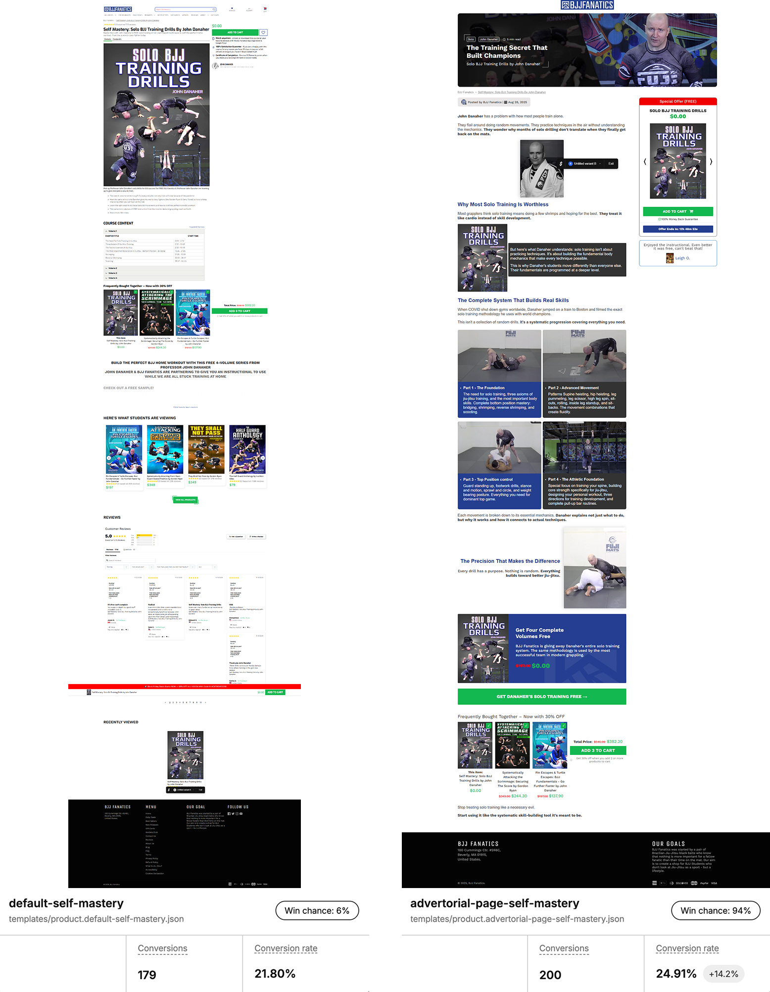
Most brands don’t test things like this they launch a product, write a clean description, add bullets and images, and call it a day. Especially when the product is free.
But when you’re in the trenches, fighting for margin, optimizing funnel flow, and trying to convert cold traffic, every pixel matters.
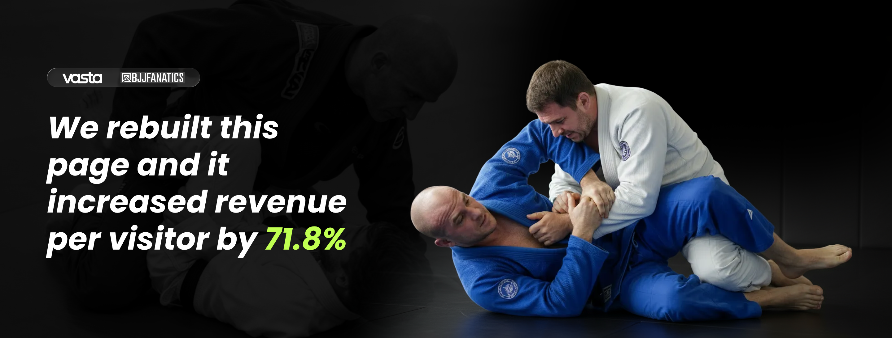
We kept the product, price, and traffic the same. The only thing we changed?The way we told the story.
We had two versions of the same offer:
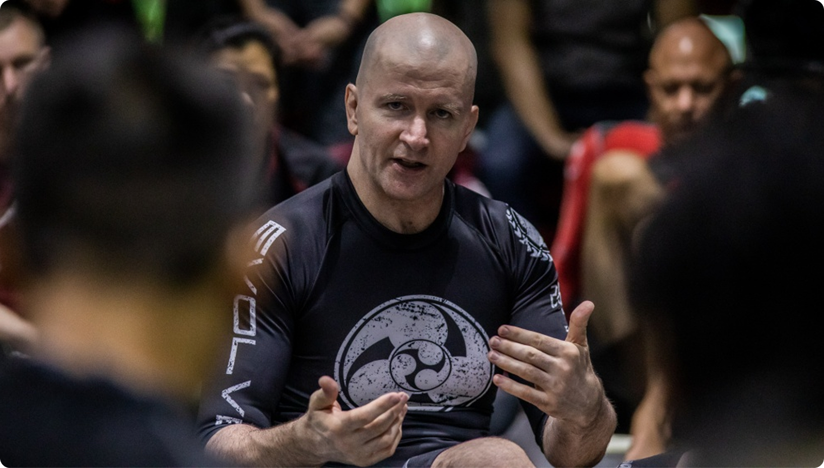
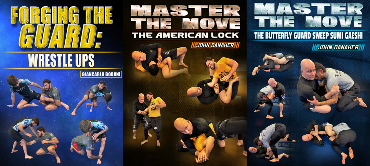
Both pages offered the same product: a free, 4-part training program from legendary coach John Danaher, designed for grapplers stuck at home or training solo.
But the results couldn’t have been more different.
These weren’t minor tweaks. These were structural upgrades to how the story was told, and they led to dramatically different buying behavior.
After just 2.5 weeks of 50/50 split testing, here’s what we saw:
%201.png)
%201.png)
Let’s be real: product pages are built for action.
They assume the visitor already knows what they want. They push CTAs, emphasize logistics (shipping, pricing, guarantees), and strip out anything that might slow the “buy now” path.
BUT HERE'S THE PROBLEM…
The advertorial, on the other hand, does the one thing the product page never could:
It makes you feel something before you even see the product.
Then and only then… it introduces the offer.
No hard push. No pressure.
Just a narrative that makes the reader say: “Okay, now I want this.”
At its core, the advertorial didn’t just present a product; it presented a new way of thinking.
Most grapplers believe solo training is a necessary evil, something you suffer through just to stay active.
It showed that solo drills aren’t just filler… they’re foundational.
Instead of treating solo reps like “doing pushups in your living room,” the page reframed them as mechanics-based skill building: with structure, progression, and championship-level methodology.
By the time readers reached the CTA, they weren’t just interested; they were already sold on the concept.
The product became the next logical step in their journey.But this new page flipped that belief.
THIS TEST WASN'T JUST A WIN FOR BJJ FANATICS. IT WAS A PROOF POINT FOR A LARGER PATTERN WE'RE SEEING ACROSS SHOPIFY STORES:
When you shift from pushing products to presenting beliefs, performance goes up.
BELIEFS PRE-SELL.
This transformation didn’t happen by accident.
It’s the result of a service model we’ve implemented across +450 Shopify brands, built around four capabilities that consistently move the needle:
THIS ISN'T ABOUT "JUST FIXING THE COPY"
It’s about building a page that thinks like your customer, and converts like your best salesperson.
Most brands think their site is “good enough.” But as this test showed, there’s often 50%+ more revenue hiding in plain sight… just beneath the structure of the story.
If you’re running paid traffic… if your conversion rate is under 4%… or if you just feel like your store should be performing better…
We help brands understand why, and fix it. Not with guesswork, but through data, behavioral insight, and structural clarity.
Because when the right audience doesn’t buy, the problem isn’t the product; it’s how the story is being told.
.png)
.png)